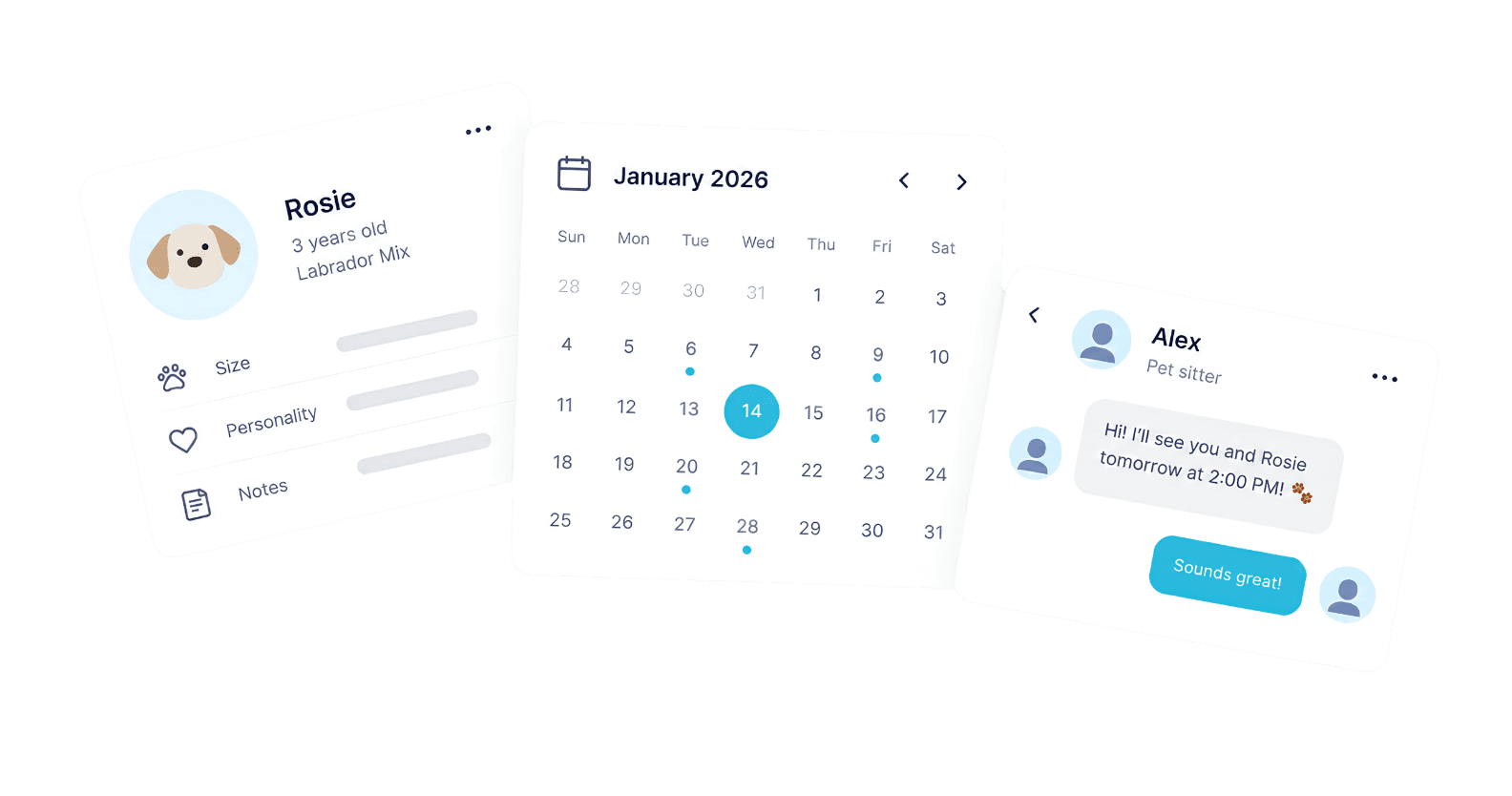
Rebuilding the service completion flow for a pet care app

TiriVelo Pet Care Services Inc

Timeline

May - Jun 2026

Role

Product designer

Category

Product design

Collaborators

Design, engineering & leadership

Timeline

May - Jun 2026

Role

Product designer

Category

Product design

Collaborators

Design, engineering & leadership

Timeline

May - Jun 2026

Role

Product designer

Category

Product design

Collaborators

Design, engineering & leadership

Overview

Designing the end-to-end mobile experience for a Canadian pet care service platform

Overview

Designing the end-to-end mobile experience for a Canadian pet care service platform

Overview

Designing the end-to-end mobile experience for a Canadian pet care service platform

TiriVelo is a Canadian pet care marketplace connecting owners with verified providers for dog walking, pet sitting, and beyond. As one of five UX designers on a six-week capstone, I owned the provider service completion flow and led the design of messaging and notifications for both sides of the platform, with a goal of working toward MVP launch readiness across 40+ screens.

TiriVelo is a Canadian pet care marketplace connecting owners with verified providers for dog walking, pet sitting, and beyond. As one of five UX designers on a six-week capstone, I owned the provider service completion flow and led the design of messaging and notifications for both sides of the platform, with a goal of working toward MVP launch readiness across 40+ screens.

Short on time?

Context

TiriVelo had an existing mobile experience, but key journeys needed refinement for real-world use

Context

TiriVelo had an existing mobile experience, but key journeys needed refinement for real-world use

Context

TiriVelo had an existing mobile experience, but key journeys needed refinement for real-world use

TiriVelo already had a large set of mobile screens designed by previous teams, but many of the core journeys were inconsistent, incomplete, or fragmented. Other parts of the experience had yet to be designed at all.

Our team of five designers was brought in to build on that foundation, refine existing flows, and create missing experiences to bring the mobile app closer to an MVP launch.

My focus

I owned key parts of the provider service completion flow across 40+ screens.

Team scope

Service completion

Messaging & updates

Onboarding & profiles

Search & discovery

Booking & checkout

My focus

Service completion

Service completion checklist

care report

Messaging & updates

Notifications

Messaging

This case study focuses just on the provider service completion flow, from starting a service through completion, care report, and payout.

Problem

Providers needed clearer guidance through each step to complete the service

Problem

Providers needed clearer guidance through each step to complete the service

Problem

Providers needed clearer guidance through each step to complete the service

Before redesigning the experience, I audited the 42 inherited screens within my scope to understand where the provider experience was creating friction. I identified 25 issues across hierarchy, service completion, and payout communication.

Providers were unsure which steps to take and what was required to complete a service
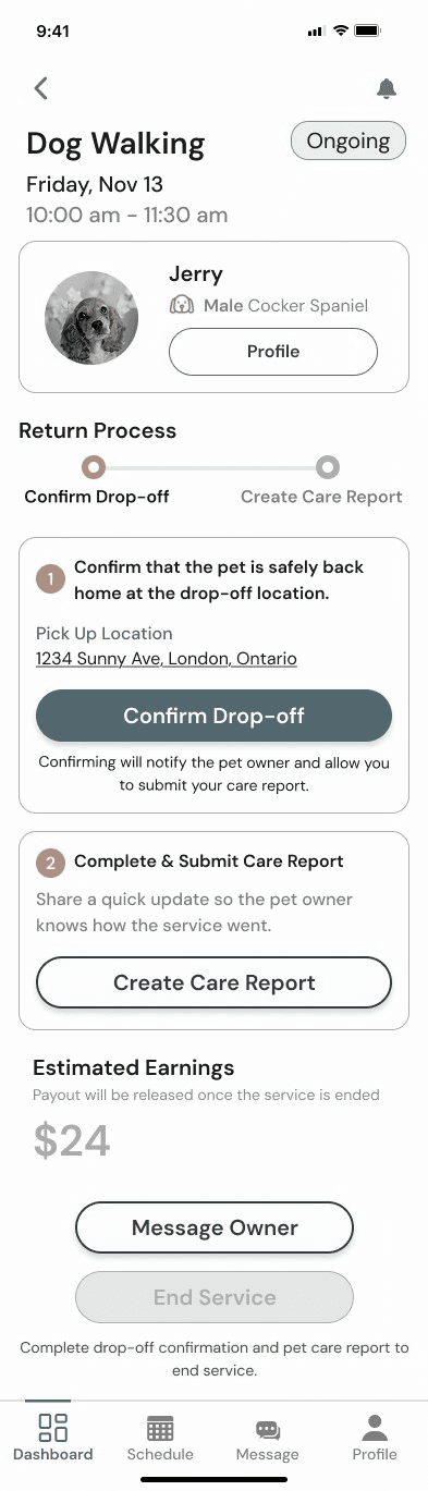
Inherited service completion screen

Explore usability gaps in the inherited flow

01

Next steps weren't always clear

The required steps were visible, but providers had to interpret multiple elements to understand their current status and what to do next.

02

Unclear completion point

Drop-off, the Care Report, and “End Service” were treated as separate actions, making it harder to understand when the provider’s responsibilities were actually complete.

03

Payout lacked context

Estimated earnings were visible, but the experience didn’t clearly explain how completing the service, owner review, and receiving payout were connected.

Key usability issues

01

Next steps weren't always clear

The required steps were visible, but providers had to interpret multiple elements to understand their current status and what to do next.

02

Unclear completion point

Drop-off, the Care Report, and “End Service” were treated as separate actions, making it harder to understand when the provider’s responsibilities were actually complete.

03

Payout lacked context

Estimated earnings were visible, but the experience didn’t clearly explain how completing the service, owner review, and receiving payout were connected.

Design

Designing one guided experience from service start to payout

Design

Designing one guided experience from service start to payout

Design

Designing one guided experience from service start to payout

Making the next step of the service clear

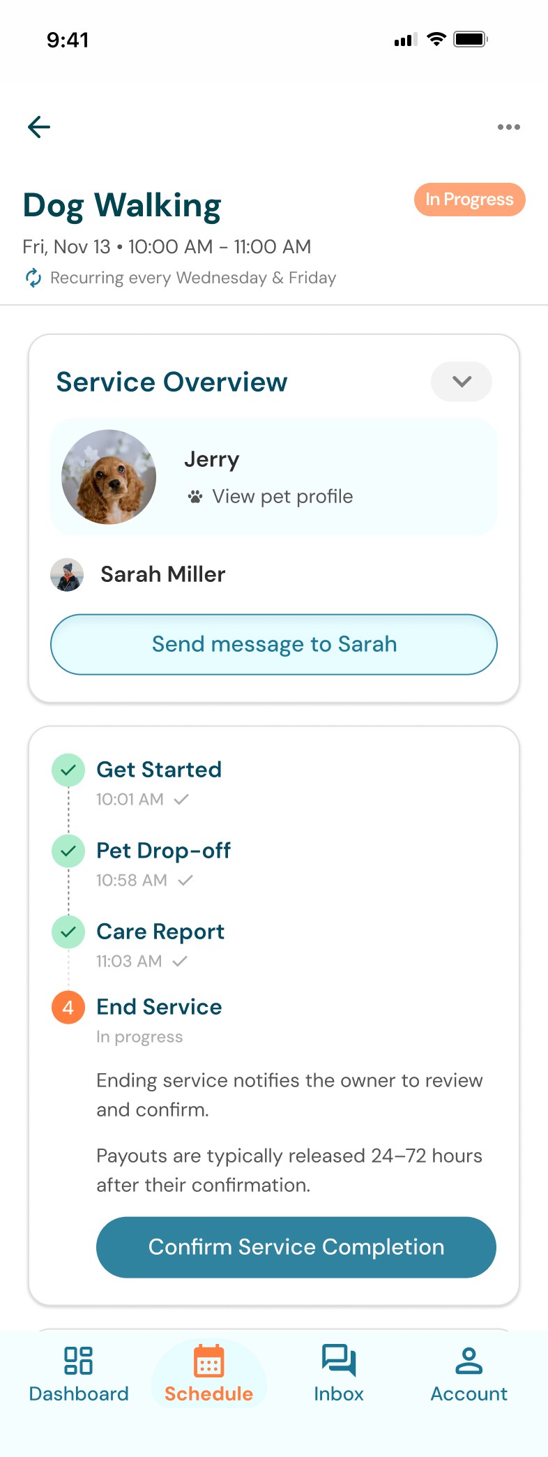
I reorganized the Service Overview around a sequential checklist that gives every stage a clear status and action. Providers can quickly see where a service stands, what they need to complete next, and when it is ready to close.

Service completion flow

Service overview

Service checklist
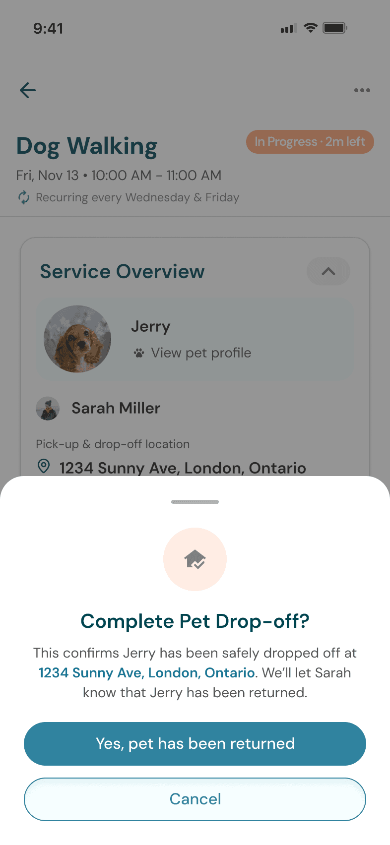
Confirmation modules

Integrating the care report into the service completion flow

I consolidated the care report from three separate pages into one scrollable experience and made its role in service completion more explicit. Progress indicators and a clear due date helped providers understand what was required while allowing them to save their work and return later.

care report

care report step in service checklist

Giving providers visibility into when they’ll get paid

I brought payout information into the service completion flow so providers could better understand what happens after completing their responsibilities and when to expect their earnings.

Payout state below the service checklist

Different payout states

Testing

Providers understood the overall flow, but testing revealed moments that still needed clarification

Testing

Providers understood the overall flow, but testing revealed moments that still needed clarification

Testing

Providers understood the overall flow, but testing revealed moments that still needed clarification

I tested the service completion flow as part of a moderated usability study covering TiriVelo's core mobile journeys. Participants moved through the provider flow from starting a service through completing the care report and ending the service.

  1. The checklist made the overall service progression feel intuitive

Participants understood the sequence of steps from starting a service through completing the care report, and the checklist helped communicate what had been completed and what came next.

  1. Service details weren’t immediately discoverable

Participants didn’t immediately recognize that the Service Overview could expand to reveal additional booking information, showing that the chevron alone wasn’t a clear enough cue.

  1. Providers expected submitting the care report to complete the service
I submit the report, and then I assume that means the service is done... and then I get paid.

Participant 1

Participants expected the service to be complete once they submitted the care report. As a result, the additional "End Service" action felt redundant, while requiring owner review before payout created uncertainty around when their responsibilities actually ended and when they would get paid.

Iterations

Turning testing insights into a clearer service completion flow

Iterations

Turning testing insights into a clearer service completion flow

Iterations

Turning testing insights into a clearer service completion flow

Testing revealed that providers expected their responsibilities to end once the service was finished and the care report was submitted.

Making service details easier to discover

Before

After

Participants didn’t immediately recognize that the Service Overview could expand to reveal additional booking information. I added a visible “More service details” label alongside the chevron, making the interaction more discoverable while keeping the information collapsed by default.

Simplifying the path from completion to payout

Before

After

TiriVelo originally required owners to review the care report before providers could receive their payout. Testing revealed that providers expected their responsibility to be complete upon completion of the care report and service.

Before

After

After bringing these findings back to the TiriVelo team, we revisited the original flow. I removed the redundant "End Service" step and revised the experience so completing the care report marks the provider's service as complete, with payout status and timing communicated separately.

Outcomes

Building a more complete experience for providers

Outcomes

Building a more complete experience for providers

Outcomes

Building a more complete experience for providers

The final experience brought service progress, care reports, completion, and payout into a more cohesive provider journey. Through testing and iteration, I refined both the interface and underlying service logic to better align with how providers expected the experience to work.

Start service

In progress

Care report

Completion

Beyond service completion

40+ screens designed across my scope

Messaging, notifications, booking updates, care reports, and service completion.

40+ screens designed across my scope

Messaging, notifications, booking updates, care reports, and service completion.

14 flows prototyped across the team

Bringing core mobile journeys together for developer handoff.

14 flows prototyped across the team

Bringing core mobile journeys together for developer handoff.

Cross-platform experience

Connecting mobile and desktop through consistent patterns and interactions.

Cross-platform experience

Connecting mobile and desktop through consistent patterns and interactions.

Thanks for visiting ⊹ ࣪ ˖

© 2026 Valerie Ma

Let's connect

NEW YORK, NY08:28 PM
Last updated:09/05/2026

Thanks for visiting ⊹ ࣪ ˖

© 2026 Valerie Ma

Let's connect

NEW YORK, NY08:28 PM
Last updated:09/05/2026

Thanks for visiting ⊹ ࣪ ˖

© 2026 Valerie Ma

Let's connect

NEW YORK, NY08:28 PM
Last updated:09/05/2026